Cards for layout in mobile apps

Cards have become a norm for layouts. More and more companies have moved to using card layouts as their main hub for information. It is mostly because of their nature as compact design elements which can be easily wrapped around many types of content while providing a great user experience.
So why cards?
For content driven websites and apps, cards are a very effective way of organizing information. Everything from text, video, images to interactive.

It all started to get popular with Pinterest, but got adapted by daily goto services like Facebook and Twitter. The Guardian labeled it the container model and for good reason. It contains data in an elegant way. Microsoft based their Windows 8 and 10 operating system on cards. Even Google renders its search results in cards on mobile.
While mobile made it fashionable, cards can be found not just on smartphones. The rendering layout works pretty well for all screen sizes. It is compatible with responsive design principles and provides a consistent experience across different screens, it works even for wearables like watches.
Your gateway to rich content
The apps that we build usually feature a “central place” — a gateway to detailed content. It might be something that you open up when you start and plan your day or it is something that you visit multiple times.
While people are visiting more and more hubs on a daily basis, we as product designers need to present and maintain different entry points that take them to specific content which valuable at the right time.
Cards help tremendously in providing experiences that encompass more than just a single task.
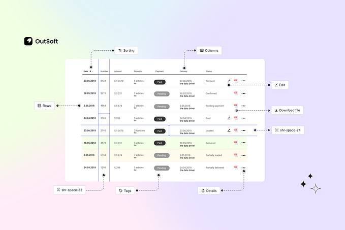
So what are cards? Cards are basically containers for different types of content and enclose it in an entity that can be mixed and matched, presented in a recognizable way.
Listing Items
Organize similar content into cards. Each item can be an action and tapping should open up a detail view. Create lists of cards to provide a high level overview of the available content. When listing similar items, like apps in a store, you can segment based on category and provide a scrollable list for the items. You can think of this as a “sign” of the actual app. Make sure to render information that helps the user decide which card to open for additional details.

Enhanced productivity
Content cards are relevant in context. Your users might be browsing a list of leads with the goal of finding the more valuable ones. Let’s say you are building a CRM and have a page to list leads with name, photo and phone number. In addition to that you can provide key actions that help the user make progress faster. Think about what is important to the user when browsing the list, what is a common action? It may be rating items or tagging. Whatever it is, provide additional UI elements placed in a consistent way. Limit to one-two actions, more can be shown in the detail view. Don’t overwhelm with choice.

Maintaining consistency
Cards can provide a unified look & feel for your app. Instead of just printing inline lists with images and text, you can format and show the data in an easily navigable format. This translates well to many screen shapes and sizes.

Mix & match
Cards have a unique characteristic of enclosing content in a frame while maintaining consistency. Use it to provide structure when you have to render multiple types of information.

Cards are useful tools that help in rendering and organizing data in a consistent and usable way. Use them to provide an overview of the greater data set.
All examples were built with Mobiscroll. Download and remix demos and make your app shine.

Written by Levi Kovacs. Originally published on the Mobiscroll blog.
If you enjoyed reading, it would be great if you could hit the green 💚 ‘Recommend’ button below to help others find it on Medium.